The Psychology of Color in Interior Design

Vibrant greens and yellows, deep purples and blues, energetic reds and oranges – many studies have shown that color can have a major impact on our mood and how we perceive the environment around us. In this article, we’ll be taking a look at how the psychology of color can be used to change the atmosphere of the interior space and how it can be used in marketing and branding for commercial design projects.
How Color Affects Our Mood
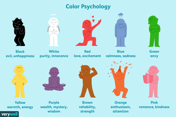
While research shows that color does have an impact on our mood and perception, how we perceive different colors is heavily dependent on the culture in which we were raised. For example, Western countries tend to use white to symbolize innocence; in Eastern countries, white represents mourning. For the purpose of this article, we’ll be focusing on a Western perspective of color psychology and how it affects interior design.
Some colors, such as black and blue, can be perceived to have both positive and negative meanings. However, since we’re dealing with wallpaper, the affect color has on the space can vary since we’re not looking at the color in isolation (like in the illustration above), but rather as part of a defined space. Also, the actual wallpaper pattern can have an impact on how the color is perceived. Let’s take a closer look.
Black and Gray Wallpaper


In interior design, black and gray can be used to create a sense of elegance, maturity, and refinement. These colors are versatile and can be easily slipped into pre-existing color palettes. Black wallpaper tends to make the room feel more enclosed and smaller, so interior designers should take care when using black wallpaper in smaller spaces, such as powder rooms. Instead, consider using black wallpaper that uses a lighter color in its design, such as white. This will create a sense of balance that makes its look more prominent as well.
White Wallpaper


Using white throughout the room can make the space seem brighter and more open, but designers risk making the space feel impersonal and cold. Of course, if you factor in wallpaper designs, this isn’t a major issue. As another wallpaper color that is extremely versatile, white wallpaper can be used to create a sense of calmness throughout the space. Some wallpaper patterns feature a white background with other colors in the foreground, creating a balance between the two.
Beige and Brown Wallpaper


Beige and brown are flexible colors that add a cozy warmth to the space. These neutral colors create a feeling of familiarity within the room, making it suitable for any space due to its flexibility. Compared to the rest of the colors on our list, beige and brown wallpaper emphasize a more traditional or classic aesthetic, rather than a contemporary one. These earthy tones can be easily paired up with other colors, such as green to create a more nature-themed aesthetic, or black to create a more high-end look.
Yellow Wallpaper


Often perceived as the most optimistic of colors, yellow wallpaper can dramatically change the space. Like white, lighter yellow tones can create a sense of openness and space. Darker yellow shades add a more organic, sophisticated aesthetic. Since yellow colors are viewed as welcoming and engaging, interior designers can use yellow wallpaper in communal spaces, such as the living room and dining room.
Green Wallpaper


While lighter green wallpaper colors can add a dynamic energy to the space, darker green colors imbue the room with a sense of drama, maturity, and sophistication. As with all wallpaper colors, the darker the color, the more enclosed the space will feel. Designers should consider using darker green wallpaper in mid-to-larger spaces, such as a bedroom or living room. Green wallpaper often adds the feeling of nature or the outdoors to the space.
Blue Wallpaper


Lighter shades of blue add an air of playfulness and innocence to the room, evoking the feeling of being outside under a clear blue sky. Darker blue tones add a sense of regal elegance, professionalism, and finesse. Blue is often associated with a sense of relaxation, making it an excellent choice for areas such as a bedroom. As a color that can be equally vibrant or bold as red or orange, blue is much more flexible in its usage thanks to its ability to create a feeling of calmness throughout the room.
Purple Wallpaper


Purple wallpaper is dramatic, regal, and sophisticated. It’s also modern, eye-catching, and trendy. The lighter the purple shade, the more traditional or classic it looks; darker purple wallpaper tends to add a more contemporary aesthetic to the room. Purple wallpapers are often used to make a statement, whether it’s used throughout the space or as a single feature wall. It strikes a careful balance between being relaxing and energetic, thanks to its combination of blue and red.
Pink Wallpaper


While often viewed as a more feminine color, pink wallpaper can actually be quite versatile. Pastel pinks add a refreshingly light touch to the space that’s both playful and engaging. Darker pink colors have a glamorous appeal that adds energy to the space. Pink wallpaper with a stronger red undertone will have a more dramatic effect on the space. Designers can pair pink colors with others to create interesting results. Pairing a deep purple with a lighter pink creates a retro aesthetic, while pairing a dark pink with black or dark blue establishes a more glamorous look.
Red Wallpaper


As one of the more dramatic colors, red adds a vibrant energy to the room. Red wallpaper demands attention, making it a suitable color for use as a feature wall or as ceiling wallpaper. Even lighter red wallpaper colors add a sense of drama and intrigue to the space. With its bold appearance, designers can use red in conjunction with another color to create a more balanced aesthetic.
Orange Wallpaper


Similar to yellow, orange wallpaper adds a sense of happiness and enthusiasm to the space. It has a creative appeal that makes it suitable for rooms such as a kid’s playroom or bedroom, kitchen, and living room. Deeper orange colors add a warmth to the atmosphere, much like beige or brown wallpaper. Taking the energy of red wallpaper and the optimism of yellow wallpaper, orange wallpaper is perfect for creating that one-of-a-kind look.
Wallpaper Color in Commercial Spaces
When designing commercial spaces, color can have a major impact on a brand and how customers perceive it. Whether interior designers are working on a high-end retail store, a local healthcare center, or a modern business office, the use of specific colors gives the space its own personality.

Source: HelpScout
The chart above briefly details the 5 dimensions of brand personality, which can be useful when deciding what wallpaper color you want to go with. For example, if a brand is considered spirited and caters to a younger audience, designers might opt for a more creative or out-of-the-box wallpaper color, such as orange or purple.

Source: The Logo Company
When working on a commercial design project, successful interior designers will be able to carefully select colors that not only match the brand’s personality, but how the brand wants its audience to perceive it. Traditional wallpaper and digital murals work to create a space that has its own characteristics, and while wallpaper rolls are available in specific colorways, digital murals allow designers a world of possibilities.
Choosing Wallpaper Color
Choosing the right wallpaper color can have a profound impact on the space. If you’re looking for something specific, our extensive collection of products can be explored based on wallpaper color. Another way to look at colorways is by looking at wallpaper collections.
The same wallpaper or digital mural in different colors can create various visual impacts on the room. Take a look at this Chicago digital mural. It’s shown below in black and white, full color, and in a sepia tone.


Unlike with traditional wallpaper rolls, interior designers have the ability to fully customize their digital mural, and this extends to the color as well. With the black and white version, this gives the iconic Chicago theatre sign a sense of historic importance. The sepia color palette has a washed look that adds a vintage aesthetic to the image. Lastly, the full color version adds a vibrant energy to the room, thanks to its bold red colors.


For any designer, learning more about the psychology of color is a great way to dress up the space and really create a sense of style and personality. Even with the same wallpaper, different colors set a completely different tone, so be sure to experiment and get creative!